")
What is Responsive Web Design?
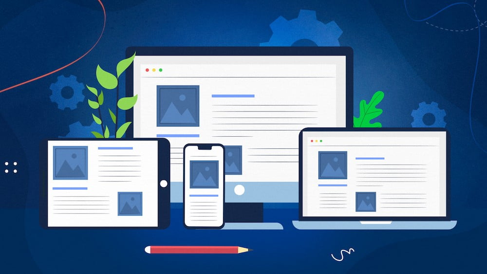
According to the principle of responsive web design, design and development should adapt to the environment and behaviour of users based on factors such as screen size, platform, and orientation.
The technique combines flexible grids and layouts, images, and a clever application of CSS media queries. The website should automatically switch to account for resolution, image size, and scripting capabilities as the user switches from their laptop to an iPad. The user may also need to check the settings on their devices; for instance, if the user has an iOS VPN installed on their iPad, the website shouldn’t stop them from visiting the page. In other words, the website should be equipped with the necessary technology to react to user preferences automatically. As a result, there would be no need for a separate design and development stage for each new device that was released on the market. This is what responsive web design actually is.
Frequently web provide you proper responsive (Mobile, Tablet, Laptop, Desktop Friendly) website.
Isha
The Principles of Responsive Web Design
For a List Apart, Ethan Marcotte wrote an introduction to the Responsive Web Design methodology. It derives from the idea of responsive architectural design, in which a room or space automatically adapts to the number of people and their movement through it:
We can apply this discipline to web design and come up with something similar but completely different. Why should we make a unique Web design for each group of users; after all, even architects don’t make buildings for every size and type of group that enters them. Similar to responsive architecture, web design ought to adapt automatically. For every new category of users, there shouldn’t be countless custom solutions needed.
Obviously, we can’t do this with robotics and motion sensors the way a building would. A more abstract way of thinking is necessary for responsive web design. However, some concepts are already being used, such as fluid layouts, media queries, and scripts that can easily (or automatically) reformat Web pages and markup.
But responsive web design is about a completely different way of thinking about design, not just adjusting screen resolutions and automatically resizing images. Let’s discuss each of these elements one by one.